Pages

Showing posts with label Art. Show all posts

Friday, January 15, 2016

Wanna Badass Sneak Peek?

Hello Creatives and welcome to 2016!!

I am so excited for what 2016 holds and I hope you are too.

If you've hopped by recently you know that I am participating in an art journal workshop called "One Badass Art Journal."

Today I thought I would share a little sneaky peek!


As you can see...we will be getting COURAGEOUS with color...embracing our inner '80s girl with some serious neon.

This 16 week class features 15 artist with 16 amazing and diverse classes, plus a bonus class of how to make an art journal.

For more info and to sign up, head to One Badass Art Journal today!

I can't wait for you to join me on this amazing journey!

XOXO, 
KERI

Thursday, December 31, 2015

Keeping it BADASS in 2016.

Hello Creatives...it's been a while...right?

I hope you have enjoyed your holidays with your families as much as I've enjoyed my time with mine.

I took some time off of my "extras" on life like blogging and running to concentrate on my family, the holidays and recovering from a running injury, but I'm back so excited to share what's coming up next.

What is a badass? 

When I was asked to join the BADASS ART JOURNAL by Tiara Smith and team I spent a lot of time thinking about what it meant to be a badass. The more I thought about it the more I realized that there are women in my life or who I admire that are all badasses for different reasons.

There are creative people like Marion Smith, Cheryl Boglioli  and  Christy Tomlinson who have not only decided to embrace their creativity, but have taken it a step farther and actually do it for a LIVING. 

There are Christine Caine and her A21 campaign to end modern day slavery all across the world.

There's my best friend Deana who is just the most giving person in the world and goes above and beyond to support and encourage her scope of influence. 

There are so many AMAZING women who are badasses in so many ways.

So what does this mean for this class? I want us to focus on what we see as badass-ness in others and what we can do to incorporate those traits into our own lives. 

I'm still putting the finishing touches on my project and video, but here's a little snippet of a recent class I did.

My style is all things bring and bold.


And as if that isn't bright enough...I'm takin' it up a notch.

How about some neon?
So be prepared for some BIG, BOLD BADASSES during this this 16 week class.

You'll make 16 BADASS ART JOURNAL pages and one BADASS Art Journal all for only $59. That's less than a Starbuck's fancy coffee a week. Totally worth it right? 

My fellow artists and I can't wait to encourage you all to be the best BADASS you can be in 2016.

See you in the classroom.

XOXO, 
KERI 

P.S. PLEASE feel free to share this blog post and please click through it to sign up (as oppose to google searching it.) The links provided is how I get paid for teaching. DOUBLE XOXO! :)


Tuesday, January 27, 2015

Going small this week in the studio!

Hello Lifers!

This week in the studio, I have been all about making mini art with ATCs.

If you are going "WHAT?" when I say ATC, let me break it down for you! ATC stands for "Artistic (Or Artist) Trading Cards" and they are exactly what they sound like...small works of art, about the size of a standard playing card (2.5in x 3.5in) that are meant to be made by an artist and then given away!

This week...I made 2 very different ATCs.

This first...is all about color!


You can see more info about this colorful creation on Marion Smith's Blog:


My second ATC is all about using multiple stencils on a small surface.


You can find step by step instructions for this ATC here:

I hope enjoy both of these little works of art and they inspire you to GO big...by going little!

XOXO
KERI 


Monday, November 24, 2014

What does the FOX say?!??

I can't believe I just said that! Haha! But...I couldn't help it! 

Today, I want to share with you a new drawing. I had seen a few videos on You Tube where they used Watercolor Crayons and I found a small set at Hobby Lobby, so I decided to give them a try...and I LOVE THEM! I'm not the greatest with regular watercolor because I like more control. I feel like I can get that from the crayons. 

Here's my foxy lady!! 


I was singing at both services at church yesterday, so I made a little graphite sketch while we were hanging between services. 


I thought she would be a lot of fun to test out my new watercolor crayons with! 


In progress...I'm not sure the best way to use the crayons, so I just started with coloring in my fox like I was just using regular crayons. I then used a slightly damp paintbrush and blended like you would regular watercolors. The watercolor crayons came with a paintbrush, but to me it seemed to fluffy so I used a smaller square brush (I will test the fluffier brush out and let you know how I like it!)


Once I was done I added some black outlines using my Faber-Castell Black PITT pens. (Sorry for the bad picture! Lol)

I have been practicing my sketching and drawing lately, so I can't wait to share more!! 

More to come! 

Xoxo, 
Keri 

Wednesday, November 12, 2014

Art Journaling with Marion Smith

Hello All!

Today I am so excited to be sharing a very special Art Journaling piece over on the Marion Smith Blog. 

Here's a little sneak peek: 


For full details, check out Marion's blog: 

http://marionsmithdesigns.blogspot.com/2014/11/through-air-art-journaling-featuring.html?m=1

Xoxo
Keri

Friday, November 7, 2014

Playing with faces.

Hello All! I wanted to drop by and show you an acrylic piece I just finished. 


She is a brown-eyed-purple-haired beauty that I am so proud of. I just recently started playing with faces and moving beyond papercrafting, so there are times I just sit down and play. And like all art...have a learning experience. There are things I like about this piece and there are things that next time I will do differently. I'm not going to say "I don't like them." Because it's all about the EXPERIENCE of trying to things and finding your style. 

So go out there and LEARN hands on...sometimes you'll learn what you like...and sometimes...you'll learn what you don't. 

Xoxo
Keri 

Monday, October 6, 2014

Art Journaling is good for the soul

Hello Lifers! 

I haven't been blogging as much as I would like too...I'm going to try to pick it up. :)

Lately..life has been a little rough. There are a lot of outside circumstances that are weighing on my heart, but they aren't things that can be easily fixed and my personality...I'm a fix-it person. I can't stand having to stand back and watch people I love hurting. 

So...i decided to pour some of those feelings into an art journal spread. 

Why? 

Because....

Sound  familiar to your situation? 

I have a huge love for vintage music, particularly vintage hymnals, so I started looking through an old one I have and was just reading the lyrics, looking for comfort. I came across the hymn "Blessed Assurance" and the lyrics jumped off the page. 

Here is where they led me....


I used acrylic paint and Heidi Swapp Color Shine and stencil to make my background. Then I layered pieces of my hymn and allowed it to speak to me. I highlighted lines that stood out to me with a stabilo pencil. 

 
I used white gesso with a Crafter's Workshop stencil. I love this shape but once I was done, I realized it kind of looked like teeth (weird thought, I know), but then I took a closer look at the left page... 


I realized that the starburst from my Heidi Swapp stencil seems to BURST through the "teeth"...which fits perfect with the hymn title "Blessed Assurance." 

As a Christian, it's because of the Assurnace in Christ that we can break through and be triumphant no matter what the situation. 

Here is a closeup of a few other of my favorite places. 


I hope today has not only inspired you creatively, but has empowered you to take hope that no matter what the situation, you have an Assurance of victory in Christ. 

Until next time...xoxo. 

Keri 

PS. I made the quote pic using Rhonna Farrer's app, layered over a pic I took and edited with PicFX. 

Wednesday, April 16, 2014

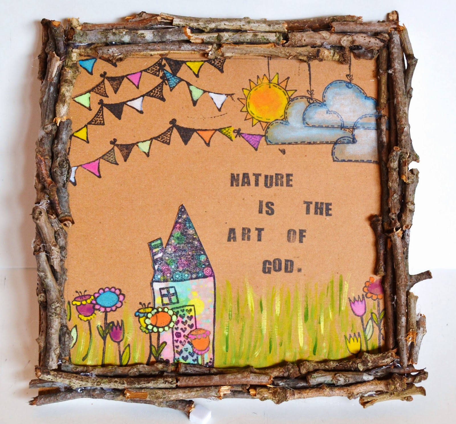
Nature is the ART of God

Hello Lifers!!

It's my day on the Susan K Weckesser blog and today I am celebrating Earth Day!!


For more details, head on over to Susan's blog: My Sweet Earth. 

Until next time...remember...make your art intentional, not an after thought. 

XOXO,
Keri

Friday, April 4, 2014

Studying with the Masters {Week 2-Gaudi}

Hello Lifers....I have a confession. 

I am in love with an older man...who's not my husband. 

BUT...before you put me on your prayer request list...it's OK...he's been dead for almost 90 years. :)

This week in "Studying with the Masters" we delved in to the architecture of Antonio Gaudi, a Spanish architect who was dubbed "God's Architect" in the last 1800s/early 1900s. 

Our teacher was an AMAZING woman named Junelle Jacobson-who I have a total girl crush on and would love to meet one day...she is just the sweetest and one of the most sincere people ever!

Gaudi was known for his close communion with God, his architecture that reflected nature and being light years ahead of his time in terms of his engineering endeavors. 

For our projects we were challenged to do 3 types of projects: a quick sketch/water color project, a mosaic and an abstract painting. 

Sketch/Watercolor 

Beautiful stained glass windows are staples in most of Gaudi's buildings; the most well known are from his La Sagrada Familia. This church is so massive in scale that 90 years after his death, it is still not finished, making it the longest construction project in history.

Junelle chose these 2 windows for us:


Look at the beauty of these windows. You can see the Christian influences: the groupings of threes (reflecting the Trinity), the cross, the colors of the rainbow (signifying God's promise), etc. 

Here is my interpretation on 4x6 watercolor paper:


Mosaic 

Gaudi's most famous use of Mosaics is in Park Guell. 

There are Mosaic benches twining everywhere: 


And the famous lizards:


I chose to use a sun mosaic:


More specifically, the top left section: 


Here is my sun:


The words come from something Junelle said in one of her "journal" entries. She was asking questions of Gaudi and his heart for God and she asked him if his mosaic were his way of saying that God sees beauty in our brokenness. 

The process of making a mosaic was long and painstaking. There were moments of feeling relaxed and moments of "OMG!!! Will I EVER be done!?" (those usually happened after I looked at the time! LOL) 

It took me about 5 hours to complete this 8x10 canvas panel. 


Abstract Painting 

Lastly, Junelle asked us to consider looking at the La Sagrada Familia a different way. Rather than trying to "duplicate" it, we were going to look at it in an abstract way, focusing on the shapes and tones, rather than specifics. 

Here is the frontal view of the basilica that we used for inspiration: 


Isn't it MAGNIFICENT?!


I have to say...this was really hard for me. It was difficult wrapping my brain around the concept of being abstract instead of literal. 

Since I was out of my element, I let Junelle "hold my hand" and followed her ideas rather than going out on my own. Once I got a little more comfortable I ventured out on my own a little, but didn't stray too far! LOL 

There was something really freeing about doing this painting. My brain tends to be a planner (and a perfectionist!) so I had to let go of some of my hangups in order to just sling paint on a canvas. 

What I Learned

This week was deeply thought provoking for me. 

A few things I took away:

(1) Take note of nature. I recently did a piece for Earth Day and used the quote: "Nature is the Art of God." Gaudi truly took that to heart. He believed that his art/architecture was his gift back to God and what better way than to mimic what God had created? (Huh...kind of like we are doing in this class...Gaudi was studying under the Master of God.) 

(2) Think beyond other "painters." When I first saw that we were focusing on an architect, I was like "what a I going to do with that?" Once we delved in though, Junelle was able to breakdown the art of his architecture to small "bite-able" pieces so that is was not so overwhelming. Yes...we looked at projects as a whole, but then she focused on smaller things like a couple of stained glass windows, an iron gate, a window and so on. 

(3) Ask "Why?" even if you will never get the answers. During her time preparing for this class, Junelle kept an un-official journal where she just wrote her thoughts on Gaudi, his projects and of herself. Questions, like "Did you liken mosaics to how God sees the beauty in our brokenness?" and "What words would I inscribe into my art if I were Gaudi?" (the spires on La Sagranda Familia have mosaics of words like "hosanna.") I need to delve BELOW the surface and the technique...there are reasons an artist does what an artist does. Meet the person....you'll have a better understanding of the art. 

(4) Let go of your hangups!! I preachin' to myself! Although Gaudi made beautiful buildings, there is very little known of his process and little to no sketches or art work. However, I would find it hard to believe that his wastebasket wasn't overflowing with crumpled pieces of discarded ideas and sketches. HE MADE BEAUTIFUL THINGS, but he didn't get there on the first try. I need to let go of the need for perfection. If a canvas doesn't "turn out" right...who cares? That's what gesso is made for. I can cover it up, start over and no one ever has to know, BUT I learned what NOT to do, so it's still a win. 

Learning More 

I can't leave you today without sharing some links:

* Junelle Jacobson...my loving sister in Christ and teacher of this beautiful subject. Her blog is called: Yes and Amen. There you can find out more information about her classes, workshops, etsy shop and more. 

* Studying Under the Masters...there is still time to join this class. It is available for 2 years, so if you can't now, I highly recommend making the time soon. And even though they are doing an artist a week, I am choosing instead to take it at my own pace and ENJOY the process, instead of just getting it done. You can sign up at Jeanne Oliver's Ning Site. 

* Gaudi Eye Candy...when you have time search the web for pictures of Gaudi's work. You will be inspired by it and once you do the math and realize he did all this by hand at the turn of the century...you will fall in love with this determined man. Here is a link to a Google search for Gaudi images to get you started: Antonio Gaudi. 

I hope you can tell from all this typing (thanks for hanging in this long!) how excited I am to be continuing on the road of "Studying Under the Masters." I am being stretched creatively and moving my thinking from passively looking at art to delving deeper, beyond technique and subject to the whys of the art. 

Until next time...remember to make your art intentional...not an afterthought. 

XOXO,
KERI

Monday, February 10, 2014

Studying Under the Masters: Week 1- Matisse

Hello Lifers!

As many of you know my One Little Word for 2014 is CHOOSE and one of my BIGGEST choices this year is to spend more time and  money on knowledge and less on stuff.

My first step towards that has been starting an online course called
 "Studying Under the Masters: Becoming an Apprentice." 


It is a 9 week course developed by Jeanne Oliver where she brings together herself and 8 other modern day arts and asks the question: What can we learn from great artists of the past if we sat at their feet and learned by doing what they did? That's the way people learned for centuries...they would be chosen as an apprentice and spend YEARS doing grunt work just for the opportunity to be around a master painter and gleam knowledge and skills from him/her. 

Week 1 is with Jeanne Oliver herself and she chose Matisse.

 I am only about 2/3 of the way through week 1, but already I am learning so much, about Matisse and about myself. This week is making me look at art differently...yes...I can say I do or don't like art, but why do I feel the way I feel? Am I seeing beyond the basics of the picture (it's a portrait, it's a landscape, it's a still-life, etc) and breathing in the COMPOSITION of it (the brushstrokes, the patterns, the medium, the white space, etc.) 

One of our "assignments" this week was to look at Matisse paintings and start seeing the patterns he used (he LOVED mixing Patterns!) We were to use a black pen and watercolors to do quick sketches of patterns that stuck out to us in some of his paintings. 

Here are 4 of my favorite paintings and patterns:


I couldn't find the name and date for this painting, but obviously I like it enough to use 2 patterns from it.


I loved the boldness of the white and red striped tablecloth and obviously Matisse liked it too...he was known for reusing props and I saw this tablecloth in at least 10 other paintings. 


I loved the elegant, gold scroll work on the wall. I like how it was such a contrast to the bolder and less-serious pattern of the striped tablecloth. 


This is "The Window" from 1916. I was immediately drawn to the flooring pattern...I guess chevron has been around for a while, huh?


I liked how some of the "chevrons" were broken. I think it says a lot for an artist letting go of the need for perfection. It was accidental, but this ended up with an ombre effect on the aqua color!


This is my favorite of the ones I am sharing today. The bold colors and patterns speak to me. It's called "Interior with Egyptian Curtain" from 1948 and it is an oil on canvas.


This window is my favorite part. I love that you know it is these big, beautiful branches outside this tropical oasis, but they are not so defined that it feels like your looking at real leaves. It keeps that feeling of fantasy. 

Isn't it great that all three of these are so different? During my search for patterns, I came across 2 other paintings I wanted to share because..again...they are so different from the ones with all of the big, bold patterns and scenes.


This one is called "Open Window Etretat" from 1920. The only real pattern is the small one on the curtain. It is serene and uncluttered. 


I couldn't find the name and date on this piece, but note how it is COMPLETELY devoid of patterns, people or props. It is simply an open door, giving the viewer hope that that open door can  lead anywhere...to anything...to anyone. 

I wanted to share a few things that Jeanne pointed out about Matisse that really hit home with me:

(1) Matisse was an insecure artist. Oh thank goodness...it's not just me! He struggled just like every other artist to find himself and his style. which lead to...

(2) Matisse was ALWAYS trying new things. If you look at his body of work, you would think the guy had multiple personality disorder. No...he wasn't crazy...he just knew that he always needed to keep growing as an artist and that as an artist...he would never truly "find" himself permanently..that art was a journey. 

(3) Matisse believed that nothing was permenant and it was OK to repeat. He might have 5 different versions of the same scene, with small changes like the medium or a color or a small movement of a prop. And these are just the changes that are documented. There were probably thousands of changes made because the chose NOT to get too attached to things and knew it was OK to paint over whatever he wasn't happy with until he was. 

So there you go...that is my Matisse journey (so far.)

I can't wait to share more with you over the coming weeks.

And if you would like to join me on this journey, you can check out Jeanne's website: Jeanne Oliver Designs for more information and to register. 

Until next time...make your art intentional...not an afterthought. 

XOXO,
KERI


Wednesday, January 22, 2014

Tuts on Tuesday...on Wednesday?

Hello Lifers!!

Guess where I am?! I am sitting at LAX waiting to board a plane for...HAWAII!!

For Real! 

My hubby had to go on an emergency 2 week business trip there (he buys seafood...long story) and after he had been gone a few days, he was like "Wouldn't it be great if you could join me?" So only by the grace of God and Him working out a TRUCKLOAD of miracles, my mom and his mom were able to tag team our kiddos so that I could go to Hawaii with him until Sunday!

Woo Hoo!

Because of that...Tuesday tutorials are a day late, but I'm not gonna leave you hangin'!

This past weekend, I was working on a mini album project and got to play with one of my FAVORITE 2 tool: Modeling Paste and Crafter's Workshop's 12 x 12 Brick Stencil.

If you're not familiar with it, modeling paste is a white substance that is the consistency of canned frosting and when it dries, it stays 3D. You can smooth it out or leave it bumpy and you can mix it with acrylic paint to change the color (and by some voodoo magic...it doesn't change the color of your acrylic! Weird, I know.)

Here's a close up of what we will learn today 
(I will reveal the FULL project at a later date.)


This is the cover of a mini-album, but you can use the technique on canvas, burlap or even just a heavy weight paper. 

Supplies You'll Need to Duplicate this (feel free to substitute for you own needs!)

Modeling Paste 
(I used Liquitex I bought in the Art Section at Hobby Lobby)

Medium and Dark Brown Acrylic Paint

Rust Red Acrylic Paint

Tattered Angels Glaze in Saffron

Brick Stencil (again..mine is by Crafter's Workshop)

Ready? Here we go!


·       We are going to start adding some texture by mixing some light brown acrylic paint with our modeling paste and light scrapping or painting through the brick stencil.


o   You want your modeling paste/paint mixture about the consistency of canned frosting.
o   Start with a small amount..a little goes a long way and it doesn’t store well for future use.


·        Start from the top of your project and work down. Take caution when you lift up your stencil that you don’t damage you hard work!


·        If you are in a hurry, grab your heat tool and speed the drying time up!


·        Once it’s dry, let’s add a little dimension. Grab your rust red and darker brown. Using your fingertips,  lightly rub your bricks first with the red, then with the brown.


·        To add shimmer and more texture, grab your Tattered Angels glaze and your heat gun. (Make sure to shake up your glaze well!)
o   Lightly swipe your glaze over your bricks.
o   While it is still wet, hit it with your heat gun. Because of the acrylic base, the paint will bubble up and once it’s cooled, will be permanent


.
(Do as I say…not as I did! LOL! I decided-obviously-after I had done the next step...hence the blue! LOL)

There you go! You now have an easy and fun new technique in your creative toolbox!

Until next time my friends...remember...CHOOSE to make your ART intentional...not an after thought.

XOXO,
KERI