Pages

Monday, February 24, 2014

Continuing the Journey

Hello Lifers!

I hope you had an AMAZING weekend! Here...we FINALLY had decent weather-YAY!

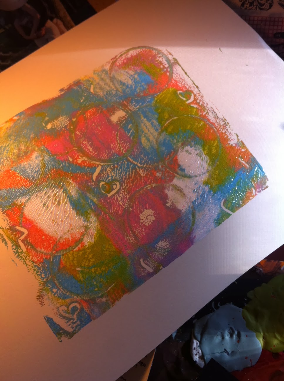
Along with the projects I teased you with on Friday, I have also been plugging away a little at a time on an art journal page that seemed to be taking longer than I planned (I think that is the story of my creative life. lol)

There is a  quote that I have seen everywhere:"Not all who wander are lost." 

After a little research (and the help of an insta-friend) I found out that the quote is a line from a poem by J. R. R. Tolkien "All That is gold does Not Glitter" from Lord of the Rings: Fellowship of the Rings

Here is the complete poem:

All that is gold does not glitter,
Not all those who wander are lost;
The old that is strong does not wither,
Deep roots are not reached by the frost.
From the ashes a fire shall be woken,
A light from the shadows shall spring;
Renewed shall be blade that was broken,
The crownless again shall be king

If you've read the books or seen the movies, you know this poem alludes to a HUGE part of the plot later in the trilogy.

For me...the quote had a different thought. I had been worrying that as I was stretching my creative wings, that maybe I was a little creatively lost. I hadn't found my "style" or my creative home yet. BUT...after reading that quote I had this thought: ART is a journey. How often do I say here that being creative is a lifestyle..not a destination? If I am constantly seeing my life as a creative JOURNEY...then I can never really be lost and wandering. I'm simply continuing my journey...wherever that may lead.

Here's is the project I came up with: 


Here is a little step by step of how I got here:

First I started with a pencil sketch:


Then I went over my pencil sketch with a fine tip Sharpie marker (my favorite...easy to find, inexpensive and works great!)


Next, I decided I wanted to fill in my blank spaces, so I decided to add some tangles. I am not great at coming up with my own ideas, so you will see me Googling "Zentangle Patterns" anytime I am working on a project like this. There are great ideas and a lot of step by step instructions.


Lastly came watercolors! This is the first time I had done a full piece in watercolors, so there was a little bit of a learning curve. 


One of the best tips I can give (as a newbie) is this: If you want the graduated look like on the blue/purple/green/gold scales section, using a thin brush, outline the inner edge of the section with a saturated color.. Then use a larger damp brush to blur the lines and draw the color slightly inward.  This will keep your more saturated colors on the edges and a washed out tone in the middle. 


There you go lifers! 

I hope this piece inspires you to not only try new things, but to let go of any worries you might have about being a wanderer. If life is a journey...we are all wanderers so you are not alone on the road. 

Until next time friends remember...make your art intentional...not an afterthought. 

XOXO,
KERI


Friday, February 21, 2014

Crazy Crafty Week!!

PHEW!!

It has been a CRAZY crafty few days here in the studio!

I finished 2 projects in 2 days and I have spent most of today editing pics and making blog posts for my friend Susan K Weckesser and a special guest blogger post (more info on that soon...I can't say anything yet!)

BUT...for fun...I thought I would give you a little sneaky peek on what I've been working on this week.


That's all I can share for now! 

(I'm evil aren't I? LOL)

I hope these give a little bit of the creative bug for this weekend. I'd love to see what you create!

See you soon! And remember...choose to make your art intentional...not an after thought. 

XOXO,
KERI

Monday, February 17, 2014

Studying Under the Maters-Week 1 Update 2-Matisse

Hello Lifers!

I wanted to give a quick little update on my "Studying with the Masters: Becoming an Apprentice" class.

I am still in week one, even though week 6 just posted, and I am OK with that. I feel like if I tried to push to do a week of videos in a week, then I would be missing out on a lot of personal growth. (1 section of videos was 2 videos an hour each...definitely don't have that much time "free" in one day! LOL) So...I'm taking my time. 

As you know, this Week 1 has been all about Matisse and we were asked to "copy" his 1901 masterpiece "La Coiffure."

Here is the original painting of Matisse's wife:


Here are a few step-by-steps of my progress:

First we were asked to do a charcoal sketch. 


Then came the first layer, starting with the darker values. (NOTE: Matisse worked in oils on canvas, but I chose to work with acrylics on watercolor paper.)


Next came the first layers of the flesh tones.


Then...I got frustrated with the skin tones, so I decided to tackle all the color surrounding her body. 


Without having a "Matisse Manual" that says "mix 2 parts this and 3 parts that with healthy dose of titanium white" it was very difficult to figure out that colors he used. It also took looking a little deeper because if you look at the original, there are grays and blues and greens along with the yellows and pink of normal flesh tones. 

Ready for MY finished "La Coiffure?"


All in all...I am very happy with it. Jeanne Oliver made a good point during the last video...we could all spend hours and hours playing with our paintings, trying to get them "just right," but then we would be falling in to the trap of trying to make an exact copy, instead of just learning from the process.

For me, being able to look at it and see that it is NOT perfect and be OK with that...well...that is a HUGE mental accomplishment for someone who tends to lean towards the perfectionist side of things. 

As you can tell, I am learning so much about myself and my art through this class and it's only WEEK 1!

There is more to come on my journey and I hope you will continue to take the ride with me.

Until next time friends...choose to make your art intentional..not an afterthought. 

XOXO,
KERI


Wednesday, February 12, 2014

Let's get "Tickled Pink" with Susan K. Weckesser!!

Hello Lifers!

It's my turn over on the Susan K Weckesser Blog "My Sweet Earth" and today I am sharing my canvas called "Tickled Pink."


I made this canvas by framing a Prima Marketing Acrylic Transparency (painted with Tattered Angels Glaze) inside a frame I made by stamping Susan's In Circle Me Stamp by Unity Stamp Company into almost dry modeling paste. 

Here are a few of my steps to help you visualize the process:

1) The Transparency

The transparency is 6x6 and was actually part of a 12x12 transparency that featured 4 different styles. I liked this one because of the little window.


I actually flipped it over and painted on the back to that when you saw it from the front, the black lines were still crisp. All the painting on the back was done with Tattered Angels Glimmer Glaze. I also added some clouds using Susan's "Celebrate Your Day" Stamp from Unity Stamp Company using Ranger Archival Ink and painted those as well. 


2) The Border:

To Make this easier, I cut a scrap piece of paper to 6x6 and lightly tacked it in the center of my canvas, leaving my boarder. (I cut the hole out to make it easier to remove later.)


Once your remove the scrap paper, keep it! You'll need it in a minute! 

Next, using your heat gun and working in small section, dry your modeling paste until no longer sticky, but still move-able. This process might take a little trial and error-trust me!

When you've reached the right consistency, firmly press your stamp into the paste, being careful not to let it slide.


While working around your frame, rotate your stamp so that you get different angles to your texture. 


See...trial and error! :) I got a little hasty on a couple of spots and ended up with modeling paste on my stamp. NOTE!! Clean the modeling paste off your stamp ASAP...it is a PAIN to get off once it's dry.

For the base color, I used Tattered Angels Plain Jane Baseboard in Plain Daffodil. Place your scrap piece of paper back in the middle to keep your lines crisp.


And then...I messed up...I did not take pictures of the next steps. So Sorry!

Here is a couple of close-ups so you can see the texture better:


To get this effect I followed these steps:

a) Once my yellow was dry, I took 5 colors of Tim Holtz Distress Ink (Pickled Raspberry, Broken China, Peacock Feathers, Peeled Paint and Spiced Marmalade)  and randomly rubbed it over my surface. I used my finger to soften it a little.

b) Next, I used Tattered Angels Plain Jane Simply Sheer in Burlap to tone my colors down a little. Keep this very light...you're wanting to tone down...not cover up.

c) Once I reached this point, my frame was still matte and it looked wrong next to my shiny transparency, so lastly I added some Tattered Angels Glam in Chandelier over the top. (A little JMO: Chandelier is the best GLAM color if you are looking to start a Tattered Angels collection. Because the base is clear and the chunky glitter in iridescent, it is very multi-purpose and less intimidating than other Glam colors.)

3) A little Finishing Touch:

To add a little finishing touch to my piece, I had these great acrylic butterfly stickers I had bought at Hobby Lobby that I thought would be a perfect addition.

Because the back was sticky, I had to do my Glaze painting on the front, so I had to be a little cautious to stay in the lines (not a fun job for someone like me! LOL!)

Here is what it looked like in the light before I added it to my project:


So there you go!

I hope you will give this technique a try. Share your link in the comments...I would LOVE to see what you do!

Until next time...choose to make your art intentional..not an after thought.

XOXO,
KERI


Monday, February 10, 2014

Studying Under the Masters: Week 1- Matisse

Hello Lifers!

As many of you know my One Little Word for 2014 is CHOOSE and one of my BIGGEST choices this year is to spend more time and  money on knowledge and less on stuff.

My first step towards that has been starting an online course called
 "Studying Under the Masters: Becoming an Apprentice." 


It is a 9 week course developed by Jeanne Oliver where she brings together herself and 8 other modern day arts and asks the question: What can we learn from great artists of the past if we sat at their feet and learned by doing what they did? That's the way people learned for centuries...they would be chosen as an apprentice and spend YEARS doing grunt work just for the opportunity to be around a master painter and gleam knowledge and skills from him/her. 

Week 1 is with Jeanne Oliver herself and she chose Matisse.

 I am only about 2/3 of the way through week 1, but already I am learning so much, about Matisse and about myself. This week is making me look at art differently...yes...I can say I do or don't like art, but why do I feel the way I feel? Am I seeing beyond the basics of the picture (it's a portrait, it's a landscape, it's a still-life, etc) and breathing in the COMPOSITION of it (the brushstrokes, the patterns, the medium, the white space, etc.) 

One of our "assignments" this week was to look at Matisse paintings and start seeing the patterns he used (he LOVED mixing Patterns!) We were to use a black pen and watercolors to do quick sketches of patterns that stuck out to us in some of his paintings. 

Here are 4 of my favorite paintings and patterns:


I couldn't find the name and date for this painting, but obviously I like it enough to use 2 patterns from it.


I loved the boldness of the white and red striped tablecloth and obviously Matisse liked it too...he was known for reusing props and I saw this tablecloth in at least 10 other paintings. 


I loved the elegant, gold scroll work on the wall. I like how it was such a contrast to the bolder and less-serious pattern of the striped tablecloth. 


This is "The Window" from 1916. I was immediately drawn to the flooring pattern...I guess chevron has been around for a while, huh?


I liked how some of the "chevrons" were broken. I think it says a lot for an artist letting go of the need for perfection. It was accidental, but this ended up with an ombre effect on the aqua color!


This is my favorite of the ones I am sharing today. The bold colors and patterns speak to me. It's called "Interior with Egyptian Curtain" from 1948 and it is an oil on canvas.


This window is my favorite part. I love that you know it is these big, beautiful branches outside this tropical oasis, but they are not so defined that it feels like your looking at real leaves. It keeps that feeling of fantasy. 

Isn't it great that all three of these are so different? During my search for patterns, I came across 2 other paintings I wanted to share because..again...they are so different from the ones with all of the big, bold patterns and scenes.


This one is called "Open Window Etretat" from 1920. The only real pattern is the small one on the curtain. It is serene and uncluttered. 


I couldn't find the name and date on this piece, but note how it is COMPLETELY devoid of patterns, people or props. It is simply an open door, giving the viewer hope that that open door can  lead anywhere...to anything...to anyone. 

I wanted to share a few things that Jeanne pointed out about Matisse that really hit home with me:

(1) Matisse was an insecure artist. Oh thank goodness...it's not just me! He struggled just like every other artist to find himself and his style. which lead to...

(2) Matisse was ALWAYS trying new things. If you look at his body of work, you would think the guy had multiple personality disorder. No...he wasn't crazy...he just knew that he always needed to keep growing as an artist and that as an artist...he would never truly "find" himself permanently..that art was a journey. 

(3) Matisse believed that nothing was permenant and it was OK to repeat. He might have 5 different versions of the same scene, with small changes like the medium or a color or a small movement of a prop. And these are just the changes that are documented. There were probably thousands of changes made because the chose NOT to get too attached to things and knew it was OK to paint over whatever he wasn't happy with until he was. 

So there you go...that is my Matisse journey (so far.)

I can't wait to share more with you over the coming weeks.

And if you would like to join me on this journey, you can check out Jeanne's website: Jeanne Oliver Designs for more information and to register. 

Until next time...make your art intentional...not an afterthought. 

XOXO,
KERI


Monday, February 3, 2014

Art Journaling on Mixed Media Monday

Hello Lifers!

It's time for a little Mixed Media on Monday! Are you ready?!

Today, we are going to be working on something that is a little new for me...art journaling! 

I have this Pinterest Board called WORD , where I pin all of these great sayings and quotes and then...what? They just sit there, occasionally pinned by others, but I never really look at them again.

So...using my One Little Word for 2014...I am CHOOSING to use them by putting them into an art journal where they are a little more accessible and so I can take time to really think about them and absorb them while I work on my art journal.  

Here is my first!


Here's a few pointers on how I made this page.

BACKGROUND 

My background is actually very simple. When I was gelli plating some paper to use for my words and my bird (I'll explain that technique in a minute), the brayer I used was covered in paint, so I simply rolled the extra pain on to my page.

To get my black chevron pattern, I used Frog Tape in their Chevron Pattern in stripes across my page. I then lightly dry brushed black acrylic paint over the entire surface. 


This is what it looks like as you're peeling it up. I LOVE the crisp lines FROG Tape gives you! (And yes...those are Mickey House PJ pants! LOL!) 

BACKGROUND TEXTURE

To add texture to my background, I did a couple of things:

1) I used acrylic paint on some of my rubber stamps instead of ink. I feel like it gave it a little more bold and solid appearance. 


The gold is a little harder to see in the pictures, but it adds some nice detail. 


You can also see that I added some stamps using Ranger's Archival Ink because it is permanent and a strong black. All of the stamps I used for this project are designed by Susan K. Weckesser for Unity Stamp Co.. They include: A little bit of Washi, Celebrate your Day, Splatter and In Circle Me. 

2) Next I stamped a vine using white acrylic paint and a Claudine Hellmuth foam stamp called "Nature" (the bird from that set is used on this page too!)

I felt like it was a little flat, so I added a little gold to the top of the leaves and some black to the bottom. 


3) Lastly, using a Hobby Lobby Stencil and Tim Holtz Distress ink in Salty Ocean, I added random blue circle all over. 


BIRD AND WORDS

For my bird and my words, I used the same technique. It's similar to the technique called "gelli plating" but since I don't have a gelli plate (which is an actual brand and a technique) a friend of mine at Alumilite (which specializes in casting resin products) made me a fantastic on out of their Amazing Mold Rubber. The great thing about making your own from mold rubber is that you can use it for this technique as well as a surface for doing resin work!

Here is my completed "gelli" print.

This is easily obtained in a few steps:
1) Add small drops of paint to your rubber/gelli plate.
2) Run a brayer over the entire surface to smooth surface out, but not blend colors. (Remember out background? The extra paint on this step becomes the foundation for this whole project!)
3) Use random things to make impressions in your paint (lids for circles, buttons, gems.) I also used the end of a paint brush to make little hearts.
4) Place your paper over your plate and lightly brayer over the back. Keep it light or you will lose the texture you added with you found objects.
5) Carefully peal it up and let it dry!

For my bird, I knew I wanted just an out line, so I painted just the outline of my bird stamp with acrylic paint and stamped on to my dry gelli print.


My words were hand painted on another gelli print and then cut and adhered. 


I hope you enjoyed this art journaling piece. I really enjoyed making it!

Until next time...remember friends...Chose to make your art intentional...not an after thought.

XOXO,
KERI